Recipe Transparency|
Native Web App
Project Summary
Role
Product Designer | Research – UXD – Interaction – UI – Testing
Nabors Impact Metrics
Web application design for issue identification, data driven performance improvement and real time operational visibility.
Project Type
Web application part of Nabors’ RigCLOUD cloud-based software suite.
Project Overview & Goal
The goal is to create a portal that enables users to promptly identify and manage issues, enhance drilling performance, and boost transparency and visibility across Nabors’ operations.
Methodology
DISCOVERY PHASE | RESEARCH
- Stakeholder Discovery: Understand what stakeholders believe the product or feature should achieve. Identify the business goals, key metrics, and desired outcomes.
- User Research: I conducted interviews with the project managers overseeing the three applications slated for integration, as well as with members of the operations team and the Remote Operations Center (ROC) operators.
IDEATE & DESIGN PHASE
- Solution Development: Creation of wireframes to visualize solutions tested and reviewed by the project managers.
TESTING PHASE
- Usability Testing: Conducted usability testing on local Nabors ROCs and third party ROCs, it included UMUX-Lite and SUS.
- Analyze results & Check Metrics: Prioritizing findings based on impact on the user experience.
- Summarize Insights: Documented findings, including test objectives, methods, participants, and key takeaways, focusing on those problems affecting usability.
- Presented Findings: Present results to product owners, operations, and some third party clients.
ITERATE ON DESIGN PHASE
- Redesigned Problematic Areas: Adjusted the prototypes to resolve identified issues, incorporating user suggestions.
IMPLEMENTATION PHASE
- Cross-functional Work with Developers: Ensuring that all the recommended updates were implemented and aligning the solutions with what was technically achievable.
- Compliance Check/Design validation: QA the implementation to ensure that met the specifications, interactions, and overall user experience.
Key Findings
- Depth comparison feature needs improvement in usability.
- Color feedback requires refinement to avoid confusion.
- Limited visibility of key parameters in the application.
- Frequent notifications can be overwhelming; customizable alerts are needed.
- Naming conventions should be more descriptive and user-friendly.
Key Solutions
- Streamline Data Display – Prioritize key identifiers, group related data, and structure critical information clearly.
- Enhance Usability – Remove unnecessary features, improve icon interactions, and automate default displays.
- Optimize Visual Design – Use intuitive colors, reduce horizontal scrolling, and invert display order for relevance.
- Enable Customization – Allow toggling between detailed and simplified views with adjustable notifications.
- Improve Data Access – Use tables or modals for deeper insights, grouping key metrics logically.
- Refine Navigation – Simplify menus, reorganize features, and ensure intuitive access to key functions.
- Support Collaboration – Incorporate user insights and team feedback for iterative improvements.
- Boost Mobile Experience – Enhance SmartNAV usability and optimize search for mobile users.
- Reduce Workflow Friction – Eliminate redundant prompts and simplify multi-step actions.
- Stay Competitive – Align with industry standards and integrate best-in-class features.
Metrics
We are just finishing the development of the MVP, focusing on finalizing core features and ensuring stability before moving into user validation and feedback.
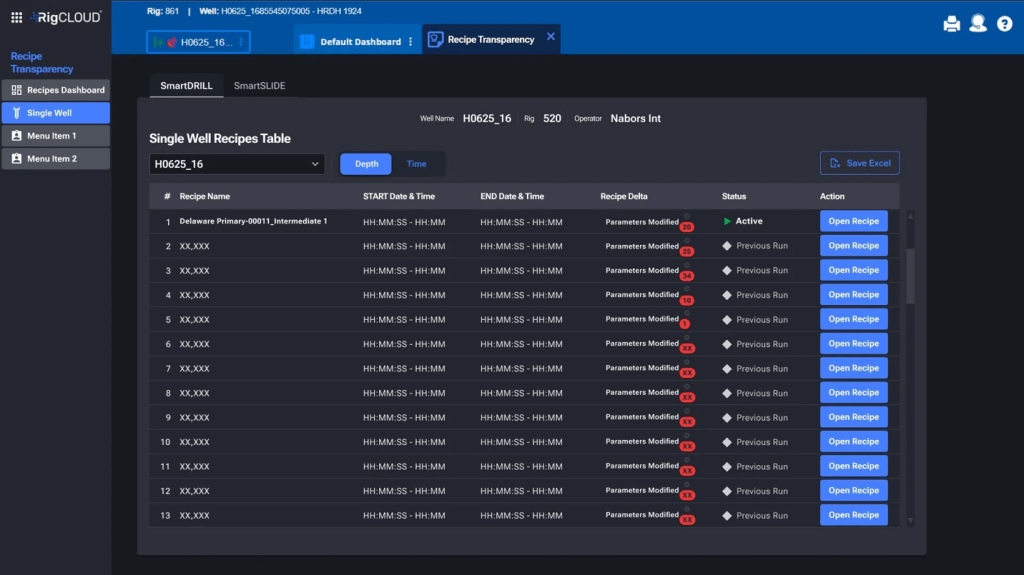
Project Screenshots and Images
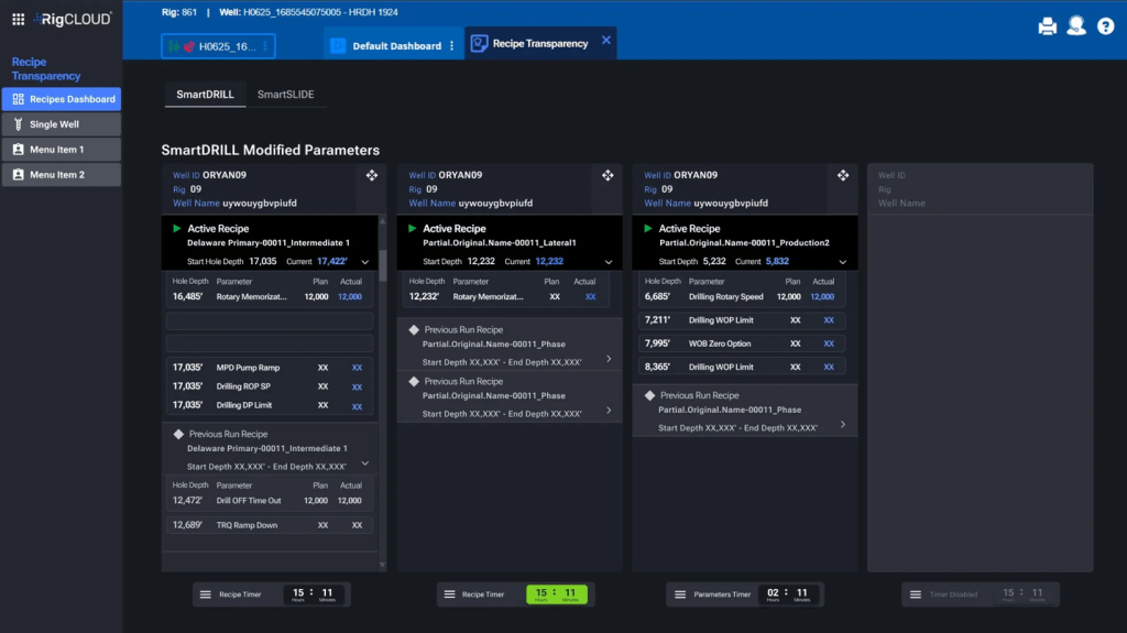
Landing screen prototype showing the SmartDRILL section
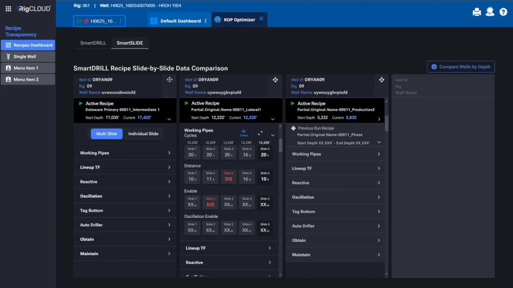
Landing screen prototype showing the SmartSLIDE section.
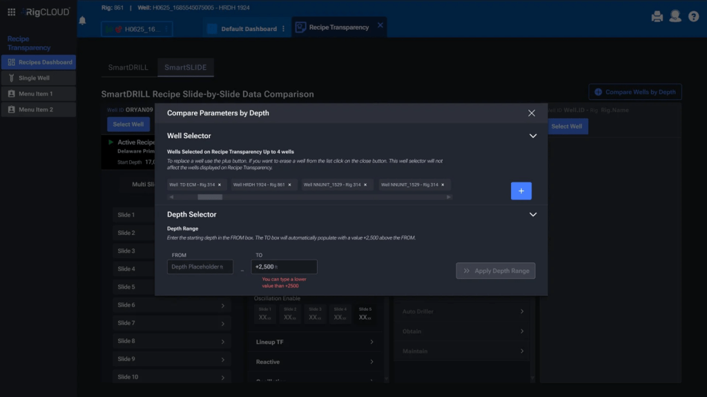
Screen for Compare well parameters by depth – Steps View
Screen for Compare well parameters by depth – Steps View
Some Deliverables
Recipe Transparency – Research
