Drill Screen Complete Overhaul |
Automation (PLC/HMI)
Research Brief
Role: Role UX Researcher & UX Lead
Research · UXD · Interaction · Testing. Led workshop facilitation and research synthesis; UI concepts.
Project Summary
Project Type PLC/HMI screen redesign within Nabors’ rig automation platform, running alongside the controls release (v4.6) and the new drawworks hardware
Project A ground-up redesign of the driller’s primary HMI — the Drill and Rocket (sliding) screens — for Nabors’ rig control system. The overhaul rethinks how a driller reads, controls, and trusts the rig during rotary drilling and directional sliding.
Project Overview & Goal
The current drill screen evolved feature-by-feature from a legacy interface, and the seams show: a vertical scroll-graph layout that drillers find harder to parse than the legacy screen, controls and graphs competing for limited real estate, an alarm banner flooded with low-value notifications, and settings buried several pages deep. At the same time, the rig is getting significantly more capable; faster drawworks, smarter stall mitigation, ROP optimizers for sliding; which raises the stakes for an interface the driller can read at a glance and trust under pressure.
The goal is to redesign the Drill and Rocket screens so a driller can identify what matters instantly, act without hunting through menus, and rely on automation rather than override it improving both safety and operational efficiency on the rig floor.
Methodology
DISCOVERY PHASE | RESEARCH
- Stakeholder Discovery: Worked with the controls, smart-products, and drawworks engineering teams, plus operations, to align on what v4.6 delivers, what the screen redesign must support, and where the technical constraints sit (e.g., screen real estate on fixed industrial displays, glove operation, the relationship between UI changes and underlying PLC logic).
- User Research: Facilitated a cross-functional workshop bringing drillers from multiple regions (North Dakota, South/East Texas) into the same room as the development teams. The format was a deliberate two-way exchange: walk drillers through upcoming changes, then capture their daily pain points, problem statements, and wish-list items directly. Drillers spanned a range of rigs, code versions, and product setups, surfacing how interface decisions land differently across operating conditions.
IDEATE & DESIGN PHASE
- Solution Development: Translated workshop findings into three drill-screen design concepts exploring how to lay out a horizontal scroll-graph interface, how tightly to couple controls with graphs, and how to reclaim real estate. The concepts were reviewed live with drillers to test layout, control grouping, and visual hierarchy against the way they actually work between drilling, sliding, and tripping.
TESTING PHASE
- Concept Review & Validation: Walked drillers through each concept and captured structured reactions: which layout reads best while operating, where controls sit too close together to be safe (e.g., a “minus” button adjacent to a “plus” button risking the wrong tap), and what could be removed entirely.
- Analyze Results & Check Metrics: Consolidated findings into a prioritized issue list (UX Design, Performance, Bug, Enhancement, Training) scored by impact on the user experience and rig safety.
- Summarize Insights: Documented pain points, user needs, recurring themes, and product-development notes, organized by system area (Alarms, Auto Driller, Drawworks, Mud Pumps, Screen Layout, and more).
- Presented Findings: Shared synthesized insights back with product owners, operations, and the engineering teams to drive the redesign and the next release.
Key Findings
- Loss of color-coded scroll graphs hurts at-a-glance reading. The legacy screen gave each parameter a distinct color (ROP, WOB, DP, Torque), letting a driller spot a spike instantly and correct before trouble; the new vertical, single-color layout makes that harder.
- The alarm banner is flooded and desensitizing; nuisance alarms drown out critical ones (ground faults, liner washers), new alarms flash only once, and there is no auditory buzzer.
- Controls and graphs compete for limited real estate. The Rocket (sliding) screen is overloaded; some data takes space without earning it (RPM, ROP/WOB graphs while sliding) while critical data (DP) gets covered.
- Settings are buried several pages deep, with inconsistent password protection adding friction.
- Drillers override automation they don’t trust; unpredictable drawworks deceleration, slow auto-driller reaction, and aggressive stall mitigation push them back to manual control.
- Managing parameters across phases is cumbersome; stroke-based pump settings must be re-entered across multiple recipes, while drillers think in flow (GPM), not strokes.
- Inconsistent terminology and weak in-app guidance create confusion and slow onboarding for new features.
Key Solutions
- Restore At-a-Glance Readability | Reintroduce distinct, color-coded scroll graphs for key parameters, reserving system red/green strictly for state and fault indication so a colored graph never reads as an alarm.
- Rebuild the Alarm Hierarchy | Suppress nuisance alarms by default, surface critical alerts with intermediate warning states (yellow) and longer flash duration, and restore auditory feedback.
- Reclaim and Reorganize Real Estate | Integrate WOB/DP/ROP data into the graph area, remove low-value elements, consolidate controls (e.g., Rotary and Torque), and give critical readouts like DP room to breathe.
- Bring Key Controls to the Surface | Place frequently used actions (breakout tongs, link-tilt bypass) directly on the drill screen, and add per-rig pinned shortcuts so drillers reach common settings in one tap.
- Design a Consistent, Glance-able Status Layer | Keep the status bar lean, use color states (a pump turning red) instead of piling on text, and add clear lock indicators for protected settings.
- Support Trust in Automation | Surface the limits drillers need (stall, DP, high-high) directly on the SPP gauge, give predictable deceleration with clear stops, and provide visible, immediate override paths.
- Reduce Workflow Friction | Move toward flow-based (GPM) control to cut redundant stroke re-entry across recipes, and smooth disruptive steps (static brake tests, confirmations) into the natural flow of work.
- Keep Drill and Slide Screens Consistent | Apply layout and interaction changes to both screens together so drillers aren’t relearning the interface when they switch modes.
- Strengthen Onboarding | Standardize feature terminology and plan for in-app guidance, quick-reference materials, and a drilling simulator for safe exploration of new features.
- Close the Feedback Loop | Establish a clear, low-friction channel for drillers to report issues and confirm their input was received.
Metrics
Research is synthesized and three drill-screen design concepts are in review with drillers. The current controls release (v4.6) holds the existing screen layout; the validated overhaul is scoped for a subsequent release, with findings prioritized for design and development.
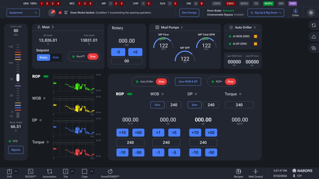
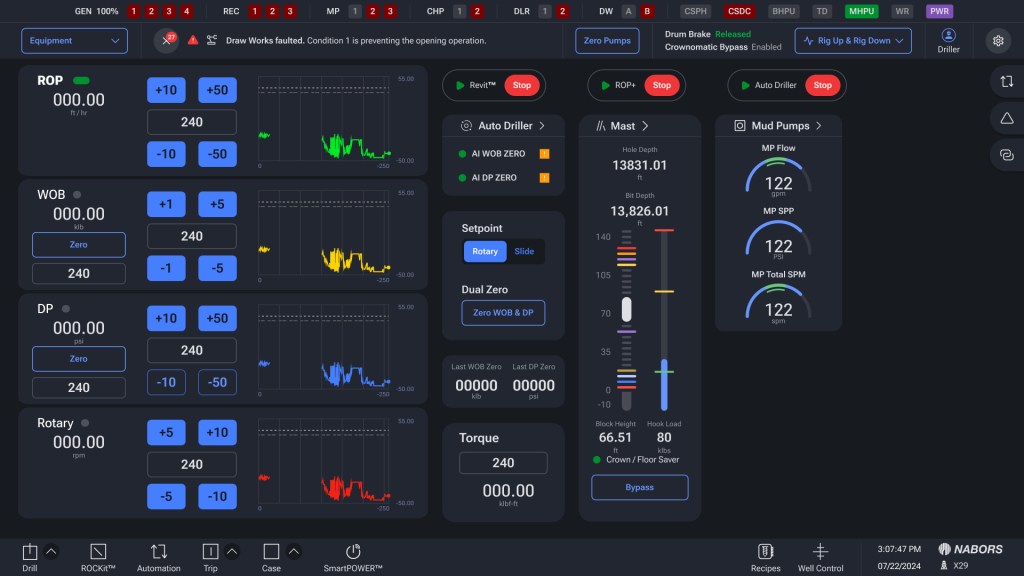
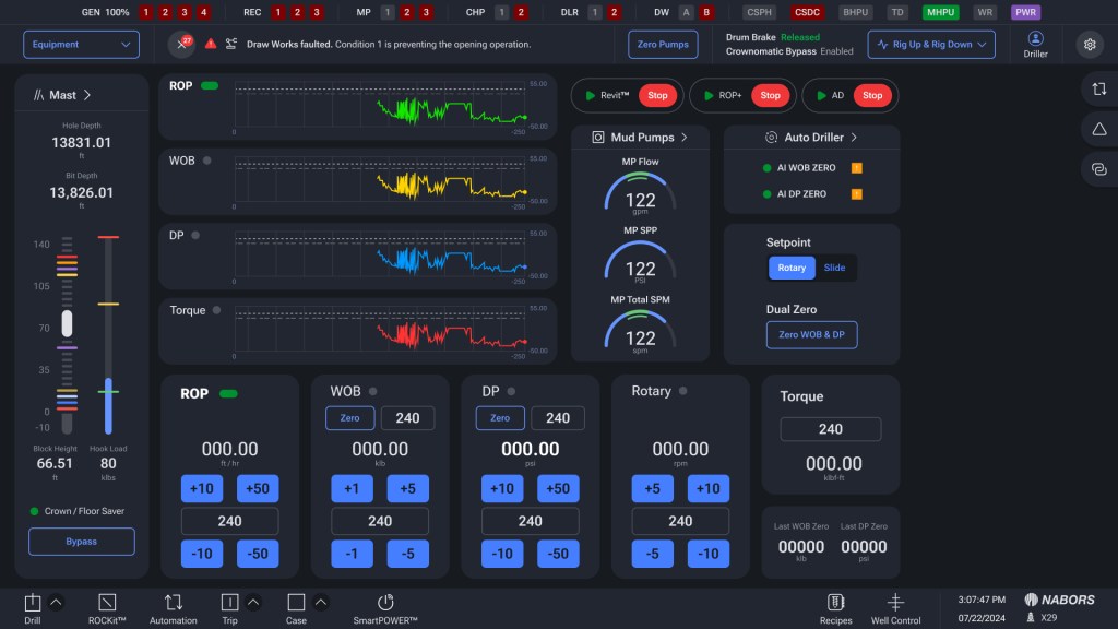
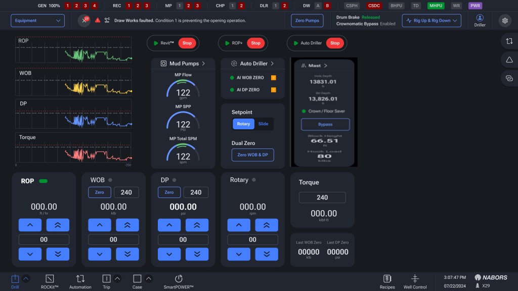
Project Screenshots and Images